Part 5 of Inspect the Web, a 6-part series. Previously: The Network Panel
In the last chapter, we learned how the Network panel provides an overview of the files our browser downloads when visiting website. In this chapter, we’ll use the Network panel to examine those files in detail.
Rather than re-explore this site’s homepage, I’ve created a special page for all the examples we’ll cover. Check it out here:
www.smalldatajournalism.com/examples/data-inspection/
Basic detail inspection
Pop open the Network panel and visit the link above and watch the traffic come in.
Then:
- Click the Images file type filter.
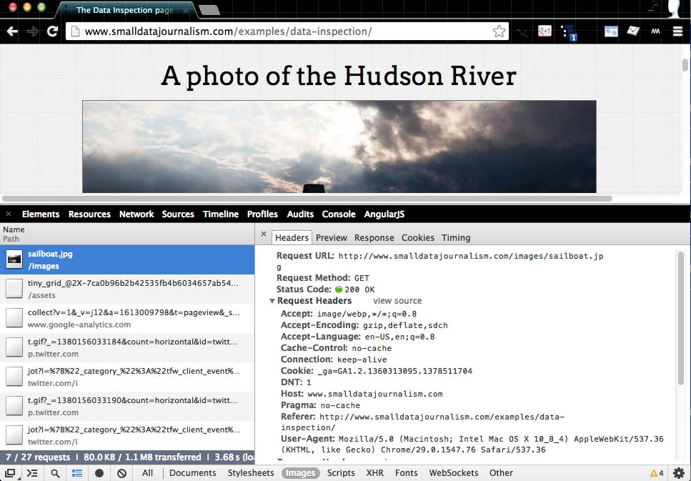
- Click on the filename for
sailboat.jpgentry
Instead of the Network table view, you should see a new subpanel:
We’ll call that subpanel to the right the Details subpanel. This subpanel has a few tabs of its own and by default, Headers should be selected. If at any time, you want to go back to the tabular view, click the X in the left corner.
Examining an Image
The Details subpanel will contain far more information than you’ll likely need to know as a non-web developer. So we’ll first run through the basic features with a file format we’re all familiar with: an image.
The Headers tab
When you visit your neighbor to borrow a cup of flour, you don’t just open his door and find him waiting wordlessly with a cup of flour. Usually you call ahead to see if he’s home and if he has flour. Or at least knock, identify yourself and what you want. Similarly, your neighbor will likely say “Hi” and, hopefully, “Of course, I have that flour, please come on over.”
Your browser and a web server are not so different, and the Headers view shows the salutations involved in exchanging files. This view has two sections: Request and Response headers.
Request Headers
These headers include information that the server will find useful in accommodating our request:
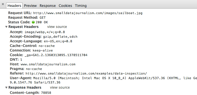
Look at this header:
Accept:image/webp,*/*;q=0.8
We may not know what this means exactly. But as we’re looking at the details for a file named sailboat.jpg, it makes sense that we’re telling the server that we’re looking to accept some image data.
Here’s another header that should seem familiar:
User-Agent:Mozilla/5.0 (Macintosh; Intel Mac OS X 10_8_4) AppleWebKit/537.36 (KHTML, like Gecko) Chrome/29.0.1547.76 Safari/537.36
I’m currently on a Mac with OS X 10.8.4 and am indeed using Chrome 29.0. If you were on an iPad, your User-Agent might look like this:
Mozilla/5.0 (iPad; U; CPU OS 3_2_1 like Mac OS X; en-us) AppleWebKit/531.21.10 (KHTML, like Gecko) Mobile/7B405
You can read more about user agent strings at Wikipedia. For now, we’ll move on as the request headers for an image file aren’t too interesting.
Response Headers
These headers contain information from the server pertaining to your request:
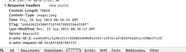
These might make sense to you:
Content-Length:78858
Content-Type:image/jpeg
These headers are reasonable given that we’re looking at the headers for the sailboat.jpg request, and 78KB is a reasonable size for such a photo.
Again, with a simple image file, there’s not too much to dissect. You can see a full list of headers at Wikipedia, but don’t worry about memorizing them. There’s only a few that we care about for this lesson.
Let’s move on to the other tabs.
The Preview and Response tabs
This tab simply shows a quick preview of the file at hand. And since we’re looking at an image file, the preview is not much different than what we already see in the browser:
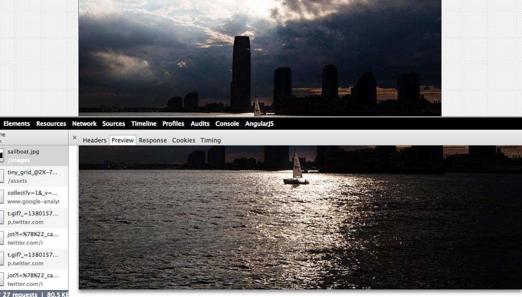
This tab will be more useful when we look at actual data files, as data files generally aren’t visible on the web page. The Response tab usually shows something similar to the Preview tab, so you can pick either one when trying to dissect a data file.
Click the X at the top-left of the Details subpanel to return to the tabular view. Now we’ll look at data files, which, I repeat again, are just text.
Inspecting data files
It’s not (usually) interesting to inspect the details of image files, as image files are usually visible on a webpage.
But data files are usually not meant to be seen, at least in their naked raw format. So now we’ll go into the [cue cliché reference to The Matrix here] and past the pretty facade that the webpage renders around that data.
Tweet Count
On the demo page, scroll down to the next section, which should show a Twitter widget/button like this:

That button may look like just another image, but it’s a little more sophisticated than that. More relevant to our concerns, it comes with a small data payload.
Check out the number next to the little birdie. At time of writing, its value is 0 – and I don’t expect it to change much.
Now open the tabular view of the Network panel. Filter for Other types of files. You should see something like this:
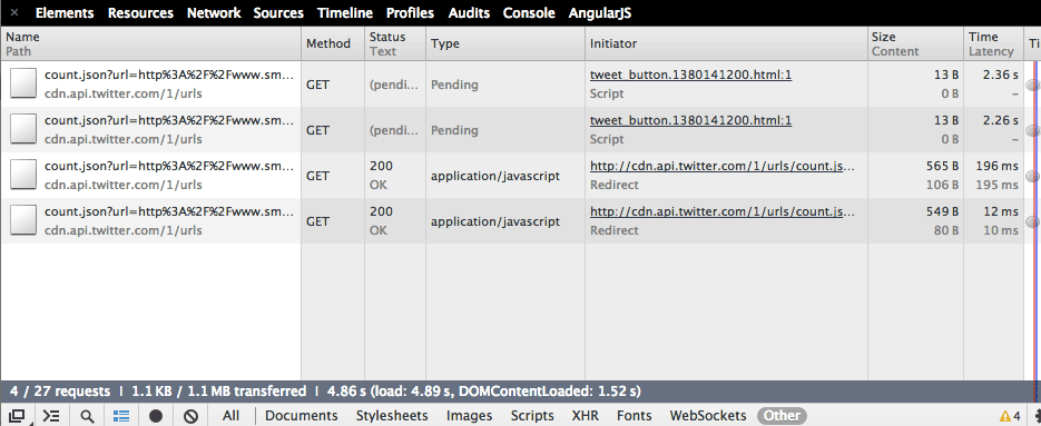
This part’s a little confusing because there’s two Tweet buttons – one is here and one is at the bottom of the page. Ignore the two files that have the Type of pending and select the first one that has, as its Type, application/javascript. This should pop you into the Detail subpanel:
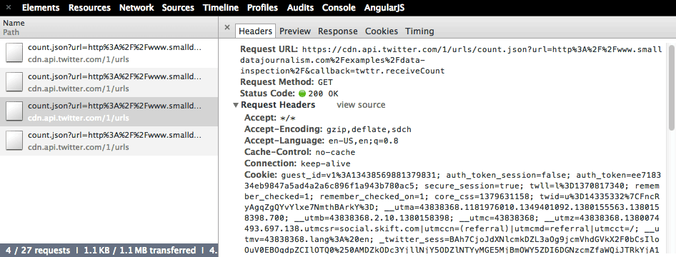
The Headers view is a little cluttered and confusing, so let’s click on the Preview tab:
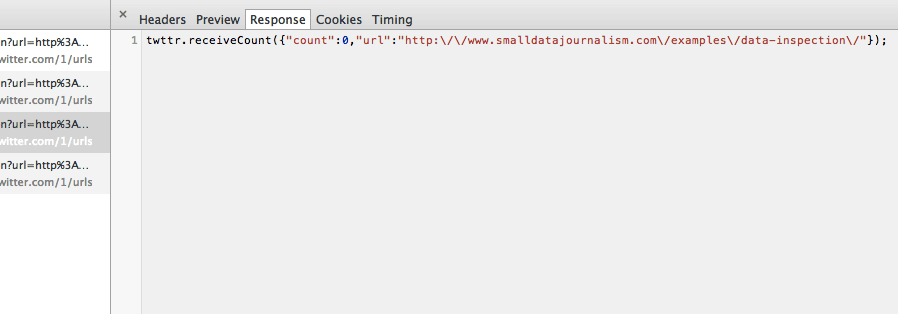
The filetype we’re currently inspecting is called JSON. For our purposes, we just need to know that it’s a lightweight way to send structured data as text:
twttr.receiveCount({"count":0,"url":"http:\/\/www.smalldatajournalism.com\/examples\/data-inspection\/"});
I’ll trim the irrelevant part and format its whitespace to make it a little prettier:
{
  "count": 0,
  "url": "http://www.smalldatajournalism.com/examples/data-inspection/"
}
Does that count value look familiar? In my case, it reflects the 0 seen on the webpage. If I had to take a guess, this is data the Twitter server sends out for the webpage to display. Similarly, if instead of a Tweet button, I had a Facebook Likes widget, you’d expect the Facebook server to transmit a data snippet so that my webpage knows how many “Likes” it has received.
(Remember in the last chapter, we learned that the webpage you’re on – in this case, hosted at www.smalldatajournalism.com – may call in third-party code, such as from Twitter)
OK, there’s not much more else to inspect with the Tweet button. So move on to the U.S. Population By Region headline.
Simple Data Chart
What you see on the demo page should look like an image:
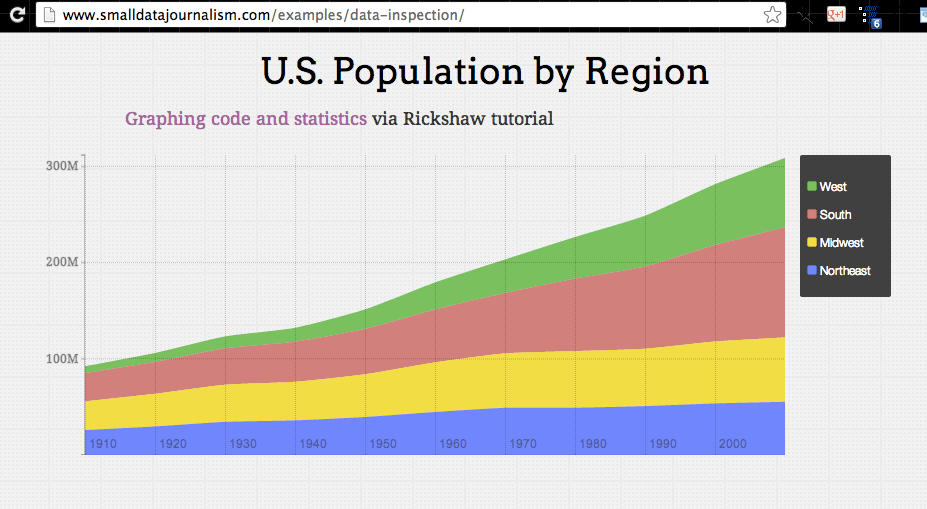
In fact, it’s a web data graphic, made using the D3 and Rickshaw JavaScript libraries. And if you’re not a web developer, you’re probably thinking, “So….?”
The bottom line is that it’s not a PNG or JPG file. And there’s a data file used to generate it. Pop open the Network panel again and filter for XHR filetypes:
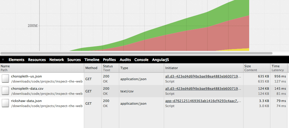
Click on the file named rickshaw-data.json and then the Response tab:
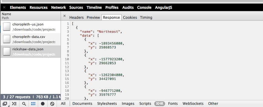
You should see some nicely formatted JSON again:
[
  {
    "name": "Northeast",
    "data": [
      {
        "x": -1893456000,
        "y": 25868573
      },
      {
        "x": -1577923200,
        "y": 29662053
      },
      {
        "x": -1262304000,
        "y": 34427091
      },
      {
        "x": -946771200,
        "y": 35976777
      },

      ...
The label "Northeast" is listed on the chart’s legend. Those numbers probably don’t seem to relate to anything. Rather than explain them, I’ll leave it to the Rickshaw graphing tutorial to explain how they’re sourced to the U.S. Census Bureau.
For the purposes of our lesson, it’s just another example of: “Look, the webpage is made up of data files!”
Close the Details panel and scroll on down to the final example for this chapter.
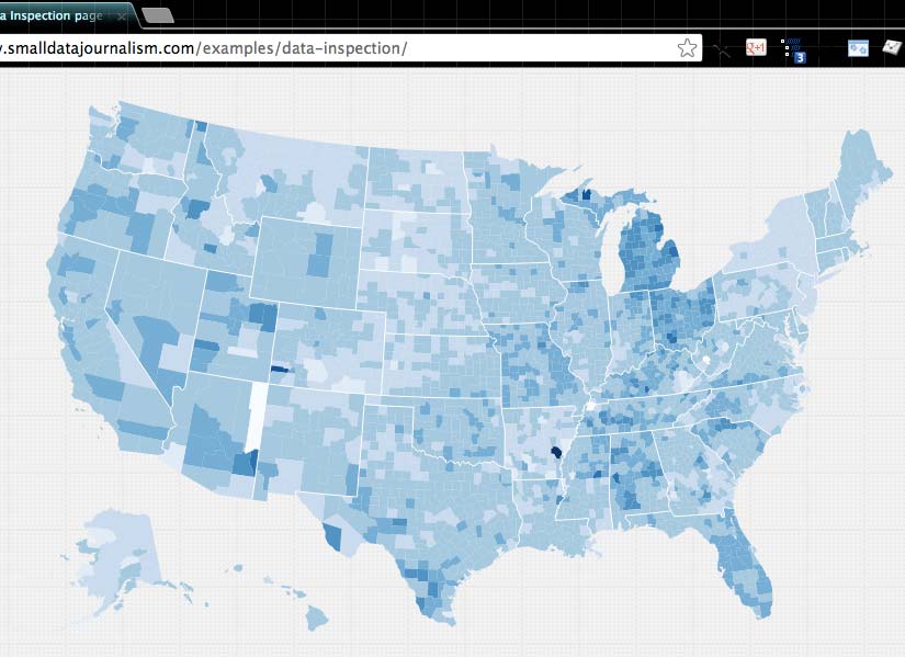
Choropleth map
This U.S. map is a variation of Mike Bostock’s D3 Choropleth Map, which shows 2008 unemployment rates by county, using color variation for the different rates – darker means higher unemployment.
The map on the demo page differs in that I’m showing the difference between unemployment rates, from 2010 to 2012. The darker the color, the greater the drop in unemployment rate:
The fact that I’ve ripped off Bostock’s code should immediately clue you in what to expect. The code used to generate the map must pull in data from some easily switchable source. In fact, this is what you should suspect of most non-trivial web widgets and graphics.
It’s not as if Bostock created a program for the sole purpose of displaying U.S. 2008 unemployment rates by county as a choropleth map.
Rather, Bostock has created a choropleth-map-making program that, in his example, happens to display U.S. 2008 unemployment rates by county.
In other words, his choropleth code is a reusable container for data. This is more than a semantic difference, it’s the sane mindset of every good developer. For our purposes though, it means that the data behind the map will likely be in their own (text) files, as it has been in the previous examples in the demo.
Pop open the Network panel and filter by the XHR file type:
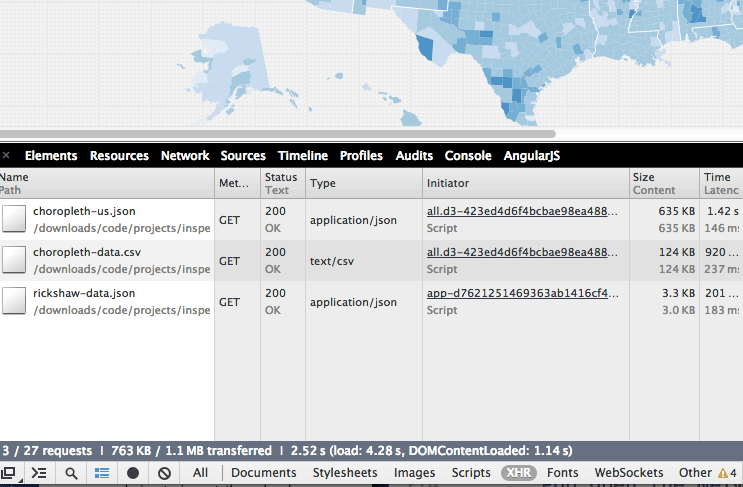
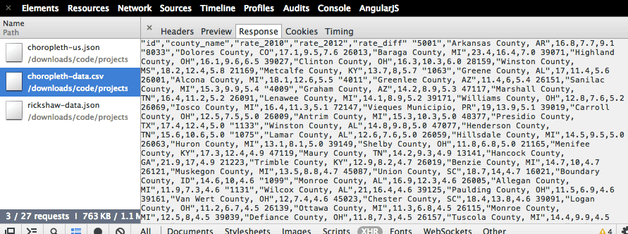
There’s two files that are related to this example: choropleth-us.json and choropleth-data.csv.
Let’s look at the Response tab for choropleth-us.json. You should see something like this:
{"type":"Topology","objects":{"counties":{"type":"GeometryCollection",
"geometries":[{"type":"Polygon","id":53073,"arcs":[[0,1,2,3]]},{"type":"Polygon","id":30105,"arcs":[[4,5,6,7,8,9]]
},{"type":"Polygon","id":30029,"arcs":[[10,11,12,13,14,15,16,17,18,19]]
},{"type":"Polygon","id":16021,"arcs":[[20,21,22,23]]
},{"type":"Polygon","id":30071,"arcs":[[-9,24,25,26,27,28,29]]
},{"type":"Polygon","id":38079,"arcs":[[30,31,32,33]]
Since we’re looking at a map, you could assume that this data is referring to shapes of things, and those things are like U.S. county boundaries. Another clue is the fact that choropleth-us.json is by far the biggest file downloaded by the demo page.
Now look at the Response for the choropleth-data.csv. The inspector doesn’t do a great job showing the file data:
So double-click on the choropleth-data.csv filename in the left column. This should initiate a download. If you check your Downloads folder, you should have a new file named choropleth-data.csv.
If you’re unfamiliar with CSV files, they’re simply text-files in which the data is delimited, i.e. separated by commas – “CSV” is short for comma-separated values. Programs like Microsoft Excel treat this delimited text as data.
Here’s what the data looks like in tabular format:
| id | county_name | rate_2010 | rate_2012 | rate_diff |
|---|---|---|---|---|
| 5001 | Arkansas County, AR | 16.8 | 7.7 | 9.1 |
| 8033 | Dolores County, CO | 17.1 | 9.5 | 7.6 |
| 26013 | Baraga County, MI | 23.4 | 16.4 | 7 |
| 39071 | Highland County, OH | 16.1 | 9.6 | 6.5 |
| 39027 | Clinton County, OH | 16.3 | 10.3 | 6 |
| 28159 | Winston County, MS | 18.2 | 12.4 | 5.8 |
| 21169 | Metcalfe County, KY | 13.7 | 8 | 5.7 |
| 1063 | Greene County, AL | 17 | 11.4 | 5.6 |
| 26001 | Alcona County, MI | 18.1 | 12.6 | 5.5 |
Naked data
Hopefully, this tour of the Network panel has illuminated a few useful truths about the Web for you. With the Elements panel, we saw how much of the Web is just text. Now we see that web pages can also be made of many different files.
This means that with the Network panel, we can inspect each file individually. Many interactive web pages are containers that pull in data files. When we inspect those data files individually to see their raw data, we’re essentially telling the web page: Thanks, but we’ll take the data as is. No need to pretty it up for us.
I made use of this concept during the Dollars for Doctors investigation at ProPublica, in which I had to collect and parse lists of financial transactions from several different drug companies.
One company had decided to display their list as a Flash application, which, while attractive, made it impossible to just highlight and copy the text. Whether or not the company did this deliberately to try to make their list harder to copy, I couldn’t say. But after inspecting the web traffic on the page, their data ended up being the easiest to copy. You can see the details in my writeup here.
So the Network panel has some practical uses when it comes to finding source files. And if you ever become a web developer, the Network panel is indispensable for diagnosing your work. But the main insight you should internalize before moving on to the final chapter is: TK
Previous:
The Network Panel
Next:
A Bit for a Bit
Project Manifest
- Inspect the Web: How to see the underpinnings of the Web
- Meet the Web Inspector: How to find and activate the Web inspector
- Elements of the Web: Just text
- Forge the Web: Instant experimentation with HTML and CSS
- The Network Panel: See the traffic of the Internet
- Inspecting Data Files: The data is just text, too
- A Bit for a Bit: You don't get something for nothing.
- Inspect Everything: The Web is only the beginning